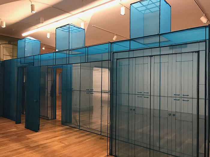
Do Ho Suh’s Almost Home at the Smithsonian American Art Museum

Do Ho Suh

Yesterday I stopped by the Smithsonian American Art Museum to see Do Ho Suh’s Almost Home exhibit. The immersive installation features hand-sewn recreations of homes where Suh has lived around the world.
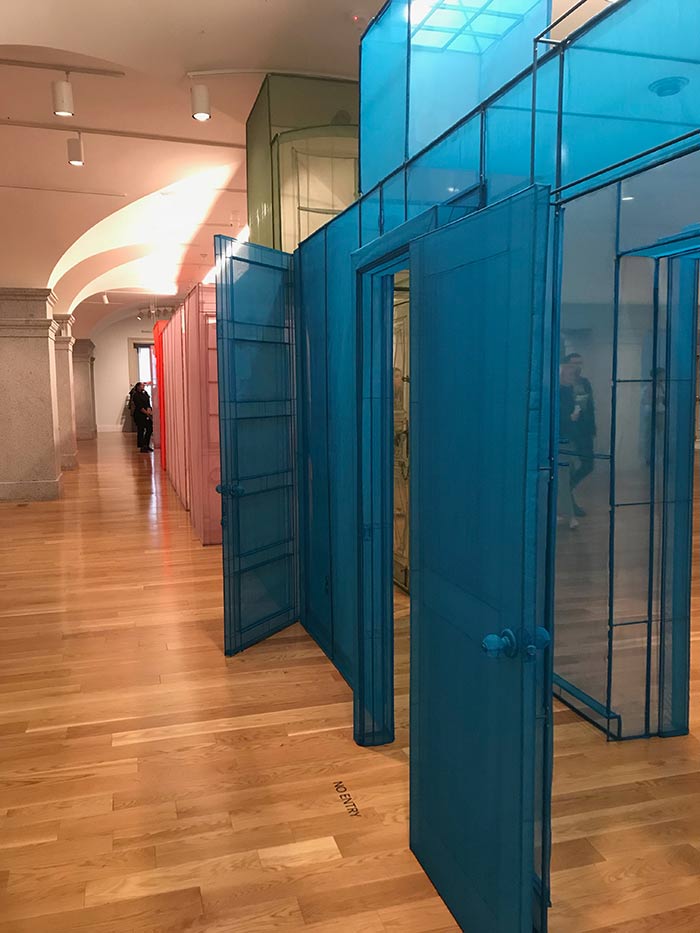
Do Ho Suh

It was amazing getting to see his attention to detail up-close and in-person. I was especially impressed with the doorknobs and piping that ran throughout the installation.
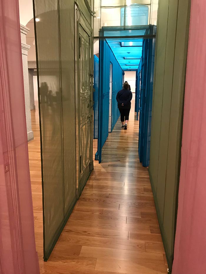
Do Ho Suh

We waited in line briefly before we could walk through the installation of bright colors. The transparent fabric made the whole art piece have a dreamlike, hazy quality.
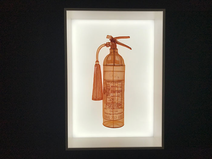
Do Ho Suh

Around the installation were several smaller pieces and studies by Suh. I was fascinated by the colors he used, and again, those details! One of my favorites was the fire extinguisher that he recreated with fabric.
Do Ho Suh

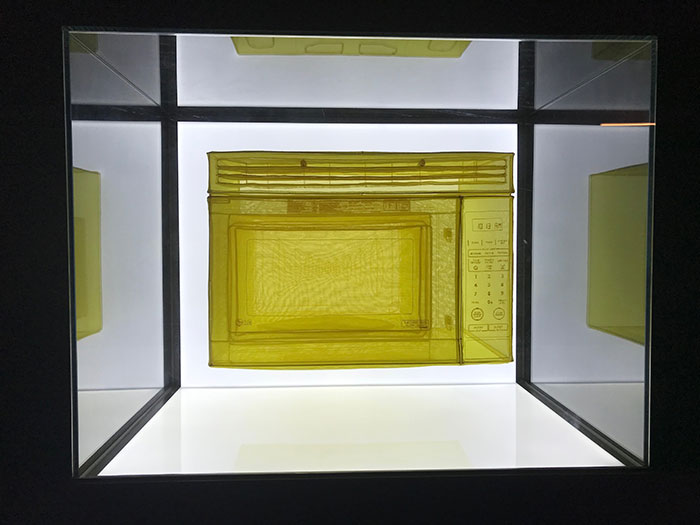
Above you can see his fabric microwave creation.
Do Ho Suh

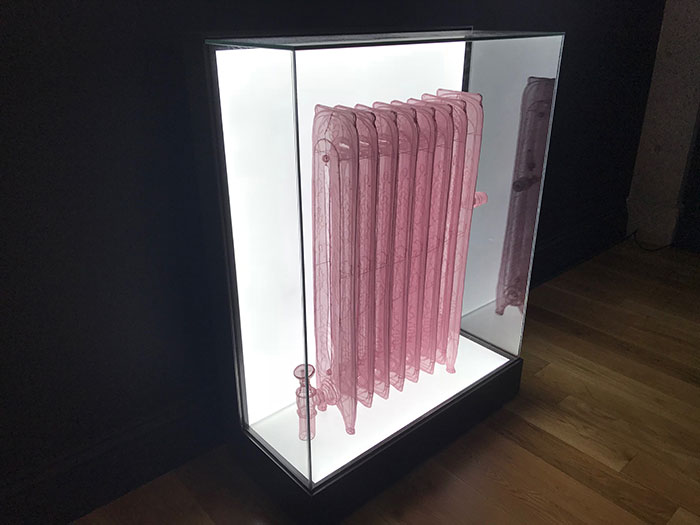
A couple of these radiators were also inside the installation.
Do Ho Suh

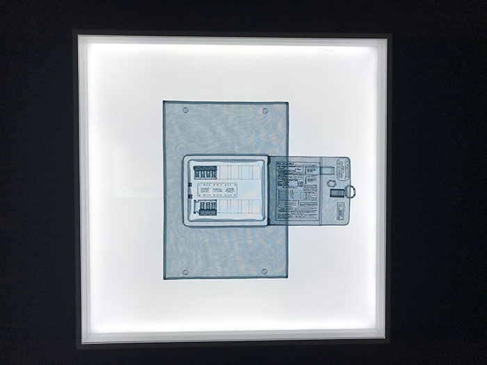
And one of the more unusual pieces was a recreation of a circuit breaker. I suppose it just seemed unusual since even though it is a detail that every home has, it’s something you don’t really expect to see represented in art.

It was definitely a fun visit taking a look at Do Ho Suh’s work. As an artist, it’s important to see what others are creating out there. That way you can get a new perspective on other artwork that’s being made, and get your own inspiration for new work.
Brian Dailey: An Odyssey at DuPont Underground

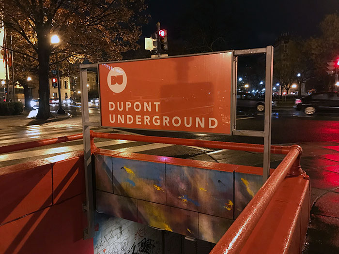
DuPont Underground

I heard about DuPont Underground a while ago, and had been meaning to stop by sometime to check it out. I liked the concept – taking an old metro station and turning it into an arts center.  So when I heard about the Homegrown DC event, where local bands were playing in the space, I bought tickets so I could see the live music and take a look at the current art exhibit.

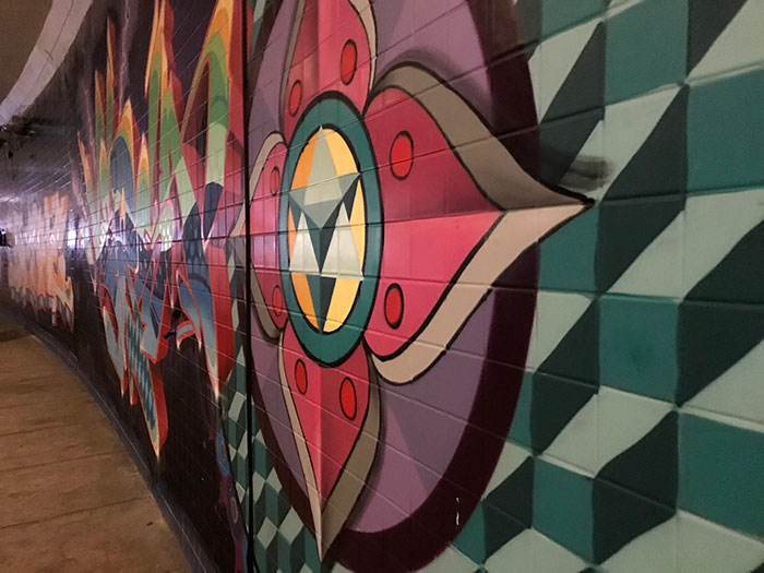
DuPont Underground

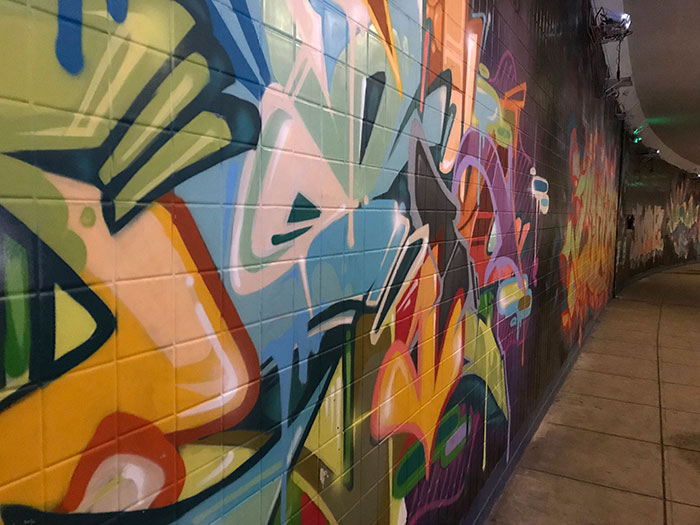
I especially liked the graffiti along the side of the space. I’ve always had a fondness for street art, I love the colors and bold lines, and having some graffiti within the art space was wonderful.

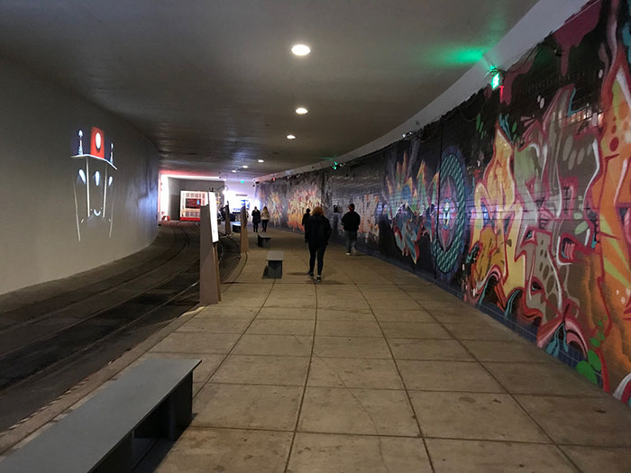
DuPont Underground

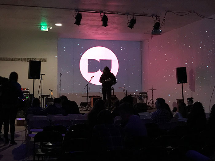
However, I was disappointed that the current exhibit, Brian Dailey: An Odyssey, didn’t make use of the entire space. Brian Dailey’s work mainly consisted of projected imagery on the blank wall of DuPont Underground. As you can see from the photo above, the art was confined to a very small portion of the space.

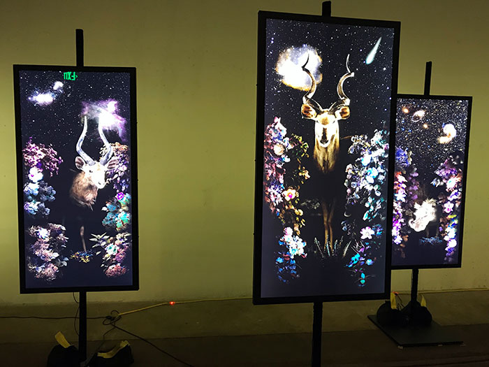
Brian Dailey at DuPont Underground

I thought Brian Dailey’s celestial wildlife pieces, part of his Impressions of Africa Redux series, were beautifully done. The vibrant colors stood out, and since I’ve always been a fan of artwork that features wildlife and animals, I was especially drawn to these pieces.

Brian Dailey at DuPont Underground

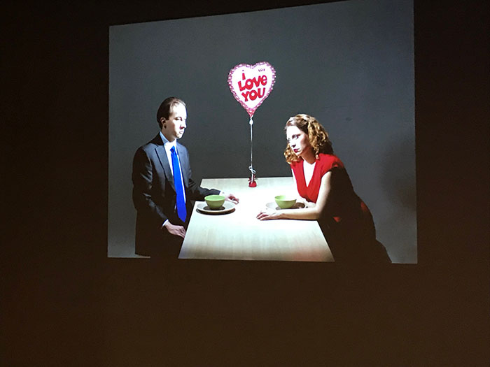
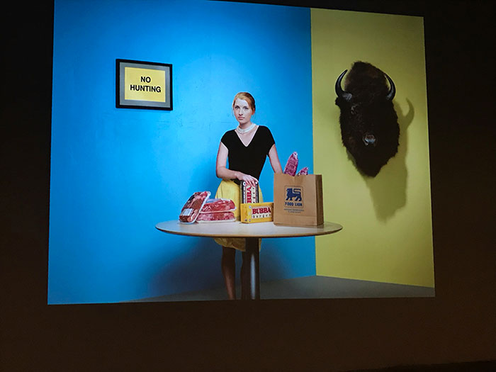
I also really enjoyed the projected scenes of people, part of his Tableaux Vivant series.

Brian Dailey at DuPont Underground

I thought Tableaux Vivant displayed an interesting commentary on everyday life.

DuPont Underground

Although the music at the exhibit was difficult to hear (the room wasn’t really prepared to have the acoustics necessary for a concert), the backdrop for the concert was beautiful in its own way.

DuPont Underground

Overall, I enjoyed seeing some beautiful graffiti and taking a look at a few of Brian Dailey’s intriguing works of art.

XYZT: Abstract Landscapes at ARTECHOUSE

Inspiration from ARTECHOUSE

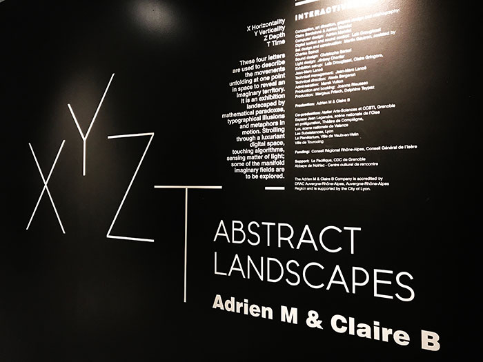
Last night I had a chance to see the XYZT: Abstract Landscapes exhibit at ARTECHOUSE – the show is closing soon, so I’m glad I had a chance to stop by. The exhibit is a world-travelled installation by French contemporary digital artists and multimedia choreographers Adrien M & Claire B.

Inspiration from ARTECHOUSE

Lately I’ve been trying to get out the studio more to gather inspiration from other artists. And I’m happy I had a chance to see this show since it allowed me to experience an art exhibit in a new way.

Inspiration from ARTECHOUSE

The show was a digital playground for people of all ages. I went to the evening admission, where only adults were admitted, and it was amazing to see how grown adults were playing with the exhibit like they were kids again.

Inspiration from ARTECHOUSE

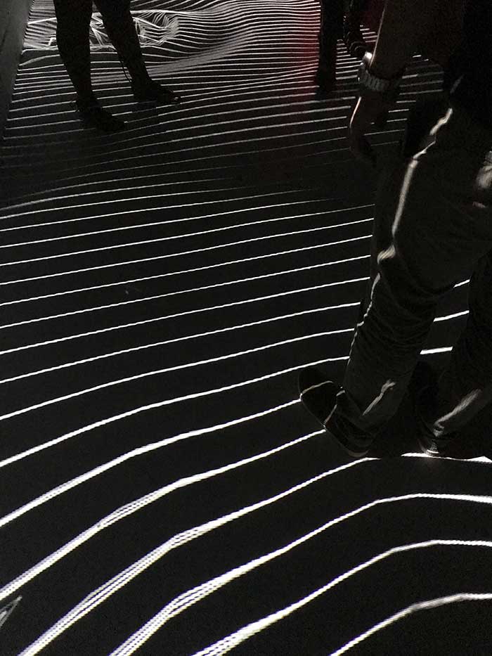
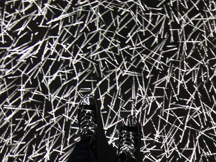
The exhibit consisted of several digital projections, and most of the projections were interactive. The image above shows a floor projection, where when you walked across it, the different particles would sense your movement and move.

Inspiration from ARTECHOUSE

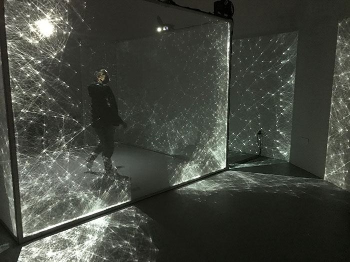
This pieces was a really fun, interactive one. It was a large cube that you’d walk into, with letters or patterns projected on the walls. You could move your hands near the walls and the letters and patterns would start moving based on your own movements.

Inspiration from ARTECHOUSE

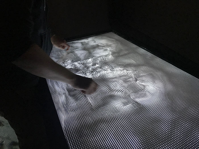
Here’s a touchscreen that had a pattern where users could create a ripple-like effect by pressing on the screen and moving their hands or fingers.

Inspiration from ARTECHOUSE

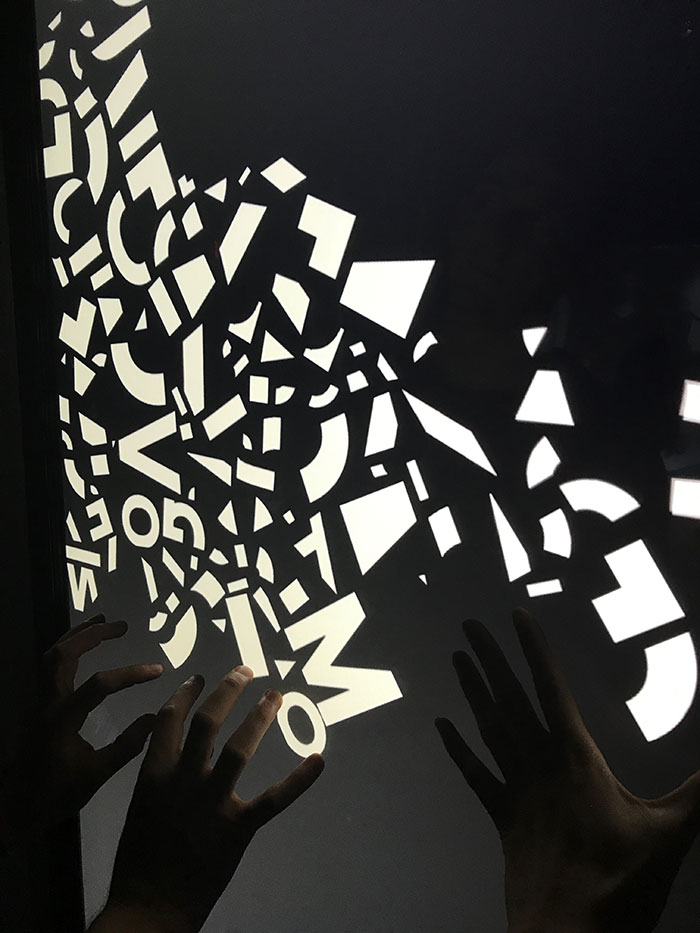
Above is another touchscreen that had letters falling from the top towards the bottom of the screen. By pressing on the screen, the letters could get blocked by your hands from falling to the bottom of the screen.

Inspiration from ARTECHOUSE

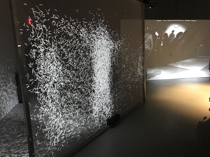
And lastly, here’s a piece where particles would clump together in sections where they sensed a viewer was standing.

Overall, the exhibit was a refreshing experience. Instead of your typical stuffy museum setting, ARTECHOUSE has a modern look and feel, and the show XYZT: Abstract Landscapes let me experience the digital world of art in a new way. However, I did think the exhibit was a lot smaller than I expected. Despite being thrown off by the size of the room, the show was an incredible experience.

Lightbox Image