This past Sunday was the opening reception for the first senior thesis exhibition. If you click here you can see the posting I did on our school’s website to advertise the exhibition. It will be open until April 30th, when the work will be taken down to make room for the other half of the seniors as they hold their exhibition. Here are pictures of all the artwork that was on display, along with the six framed collages of mine that I put up:
Senior Thesis Exhibition

April 20 – April 30, 2008
Elon Arts West Gallery; Elon University, North Carolina
From the beginning of the school year, senior art students met with a committee of professors to develop their ideas for their senior thesis exhibition. Megan worked on six collage portraits where she went through a process of intense editing for each one. This was Megan’s first cohesive body of collage work.
The senior exhibition featured the work of eleven artists who worked in a variety of media, including photography, ceramics, collage, and installation. The artists didn’t limit themselves to the media they studied—for instance, Megan was a painting major and she exhibited collages (although her collages have a heavy painting influence).
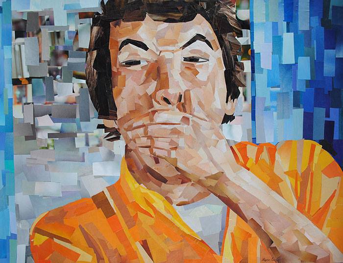
Megan Coyle’s senior thesis artwork was on display in Elon Arts West Gallery. Her thesis included the following collage portraits: “Benjamin,” “Jean,” “Bill,” “Bren,” “Scott,” and “Ali.” The exhibition lasted two weeks before it was taken down to make room for the second senior art exhibition.
The following was Megan’s artist statement for the exhibition:
I associate the people I’m close to with scenes in my mind, with memories and places that illustrate their personalities. By bringing together the human form, and the associations that illustrate these people, a conversation is created between the work and its viewers. The narratives form a story that others can imagine in their minds. Each setting was made specifically for each sitter, relating to what kind of person he or she is. For each portrait, the setting, shadows, everyday objects, and sitter’s expression, represents each figure’s personality as I see it. The variations in the developed surface have reminded me of the complexities of the different planes and areas of muscles on the human face. Thus collage works well in communicating the variety of forms and values seen when looking at people.
Senior Show Gallery Space
I went to check out the gallery space for the “All Senior Show,” which is located directly on campus in the Isabella Cannon Room. My senior thesis exhibition will be in the art department though, in a gallery that is a lot smaller than this one. Also, this week will involve a lot of intense matting for my senior thesis pieces. I’m officially graduating with an art degree, and now I just have to go through the hectic week before the opening reception. Here are a few pictures of the show:
All Senior Art Show
April 11 – May 24, 2008
Isabella Cannon Room; Elon University, North Carolina
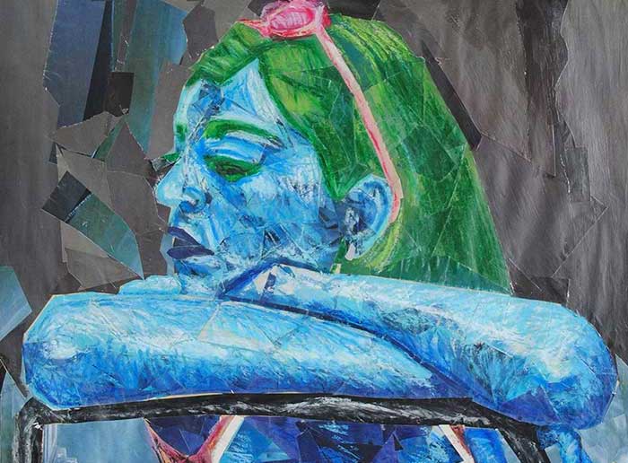
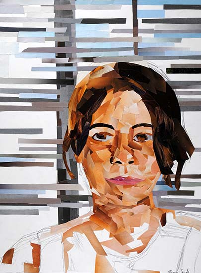
Megan Coyle’s “Figure in front of Window” collage was on display in Elon University’s Isabella Cannon Room for an all senior art show. She created this collage portrait specifically for the “All Senior Art Show.”
The art show gave senior art students a chance to showcase artwork that represented their entire body of work for that year. Megan created a series of six collage portraits for her senior thesis, where she went through an extensive process of editing each collage. For the “All Senior Art Show,” she wanted to display a piece of art that represented her collage process. “Figure in front of Window” does just that—the collage has a partially finished look which emphasizes the shape of the magazine cut-outs that have been glued down. The original paper that the magazine cut-outs are on shines through a bit, as well as parts of Megan’s underlying sketch that was done before she started collaging. The portrait shows the transition of moving from a rough sketch to a representational collage portrait.
Artists at Work: The Smithsonian Community Art Show

March 27 – July 27, 2008
Smithsonian’s Ripley Center; Washington, D.C.
Map and Gallery Info
In the summer of 2007, Megan interned at the National Portrait Gallery (NPG). After spending a summer paging through several old art catalogues, Megan became more familiar with NPG’s previous exhibitions and she became more interested in portraiture—she found herself focusing more on figures in her artwork. Her internship also inspired the work she did for her senior art thesis exhibition.
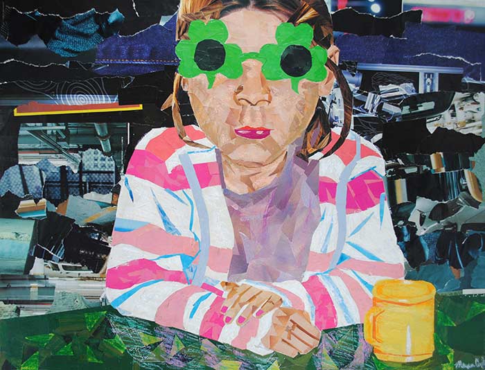
During Megan’s internship, she entered the Smithsonian’s annual juried community art show. Her collage, “Girl with Glasses,” was acceptedand displayed in the 2008 exhibition at the Smithsonian’s Ripley Center. Megan chose this particular work for her submission because she felt it represented her experience at NPG the best and it reflected the type of work the museum has—portraiture.
The exhibition showcased the work of several members of the Smithsonian community, including employees, interns, and volunteers. The work ranged from illustration to pastel work to mixed media sculpture.
The following was the introduction to the exhibition:
This juried exhibition, the Smithsonian Community Committee’s third art show, underscores the often hidden talents within the Smithsonian community. While we received over a hundred and seventy entries, only seventy could be selected for display. The subjects of these works and the materials from which they are made are as diverse as the people who comprise the Smithsonian family and the collections of the Institution itself.
Side by side are images and forms inspired by the lure of distant lands and the love of the familiar. These creations of paint, canvas, paper, charcoal, pastel, ink, fabric, metal, stone, clay and light speak of the artists’ fascination with the world around them—objects, ideas, and people often encountered through their work with the Smithsonian. They are evidence of the inspired, after-hours activities of our staff, research fellows, interns, contractors, and volunteers. Their reserves of energy, imagination, and skillfulness enhance all aspects of our everyday work.
Artists at Work: Smithsonian Community Juried Exhibition
This morning was the opening reception for the new exhibition that I have a piece in, “Artists at Work.” My collage, “Girl With Glasses,” is hanging at the Smithsonian’s Ripley Center. The exhibition will be open from March 27th to May 18th 2008. It features 70 works chosen out of about two-hundred submitted pieces. I took a few pictures of the exhibition, as well as where my collage is hanging (they’re a little blurry because of the dim lighting):
Exhibition at the Smithsonian
This past week was exciting for me because I received an email the other day about an exhibition that will be up in March. I had completely forgotten that when I was interning at the National Portrait Gallery this past summer, I applied to a juried exhibition that’s only open to Smithsonian employees–thus I had to apply while I was an intern. This week was when they were notifying artists whose work was chosen for the show.
I didn’t expect that my work was going to be accepted, and now I’m really excited. The exhibition will be at the Smithsonian Ripley Center which is on the mall in Washington, D.C.
So if you’re in Washington, D.C., you should check out the exhibition. It will be up from March 20th-May 18th 2008.
Arts and Letters Exhibition
Order a print
December 2007 – May 2008
Arts and Letters Gallery; Elon, North Carolina
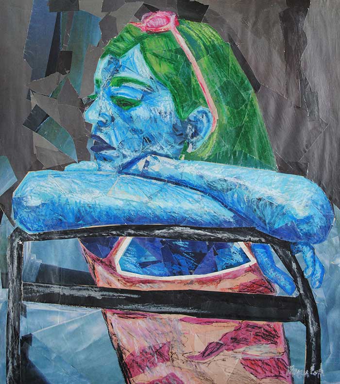
Megan Coyle’s collages “Feeling Blue,” “Pink Flower,” “Orange Lily,” and “Girl with Glasses,” and her mixed media painting, “Abstract Trees,” were approved for an exhibition in the Arts and Letters Gallery. The art was put on display in the fall of 2007 and was taken down in the spring of 2008. The gallery was located in an artist community and Megan’s work was exhibited in the main entrance gallery space. This show gave Megan a chance to share her work with other artists in the area.
The collages she selected were her favorite pieces that she had done at this time. She hadn’t focused on collage in her art for a while, and this exhibition helped jump-start her creativity and fueled a bit of the inspiration for her senior thesis work.
Gallery
This first picture is the piece that won the juror’s choice at the student juried exhibition. It was actually my least favorite of the three I entered–the other two are below. But I guess that just goes to show that what one person likes another person doesn’t like.
This semester is a rough one for me art-wise. It’s hard to get inspired these days when I have so little time to focus on my artwork. Nevertheless, I’m honored that I won an award for a piece I did this semester when I didn’t have as much time as I’d wish I’d have to work on each piece. The fridge piece is probably my favorite I’ve done this semester because I had more time and energy to put into it. The first painting down below is actually something I made towards the end of last semester.
I suppose all I really can do at this point is focus on my English work and unfortunately, my art will come second. But next semester I’ll have plenty of time to devote to my art making, which is good, considering that’s when my senior show will be.
Juror’s Statement
Here’s the juror’s statement from the “Artists Leading Elon” exhibition (it’s posted on the door to the exhibition as well):
Juror’s Statement
With extensive experience on both sides of the jury process, I have come to the conclusion that, despite any juror’s best efforts to remain impartial, selection of work is subject to the taste and biases of the juror. If a juror attends graduate school at a certain time or particular place, for example, they might have learned to value abstract art over figurative work, or think that “painting is dead”. As an entrant, you might find yourself in the unfortunate situation of entering work that reminds the juror of their ex-wife, or the background in your work is the color of the pea soup the juror was force-fed as a child. My point is this: do not be discouraged if your work was not chosen, as it is not a refection of the empirical value of your work.
My biases are as follows:
As this is a fine arts exhibition, I tended to avoid anything that looked too much like advertising… we all see too much of that, and unless you are using the language for a subversive purpose, I see no reason to make more of those images. There were some very eccentric choices, as I have a soft spot for kitsch, whether deliberately ironic or unintended. I was also drawn to work where you could feel the raw emotion, or the love, behind the making.
Some pieces were chosen because they looked like one thing, but became something else upon further inspection. Some were beautifully executed, which allowed them to transcend the ordinary subject matter that they depicted. The very best pieces that I saw here had a personal voice. The unique language of these works drew me in to look at everyday things in a new way, to experience human vulnerability, or revel in pure visual delight.
My thanks to the students for sharing your work with me, and for “putting it out there” to be chosen by others (never an easy thing).
-Kate Kretz
