I studied painting and creative writing when I was in college. As an art major, I had a project to make a portfolio website for my artwork. And that’s how I got started with web development – I taught myself HTML, CSS, and JavaScript so I could have a functioning portfolio site.
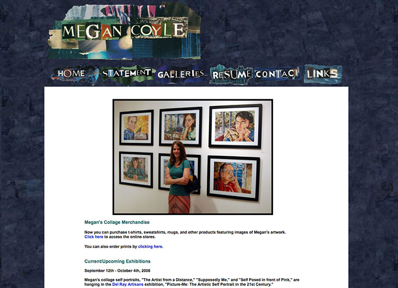
The first version of my portfolio site looked pretty terrible, but I was so proud that I figured out how to make it all on my own. I also liked how building the website was an art of its own. Above you can see that I made the header and navigational links collaged images. I later learned that using images for navigation isn’t very user-friendly, so I converted the navigation to text.
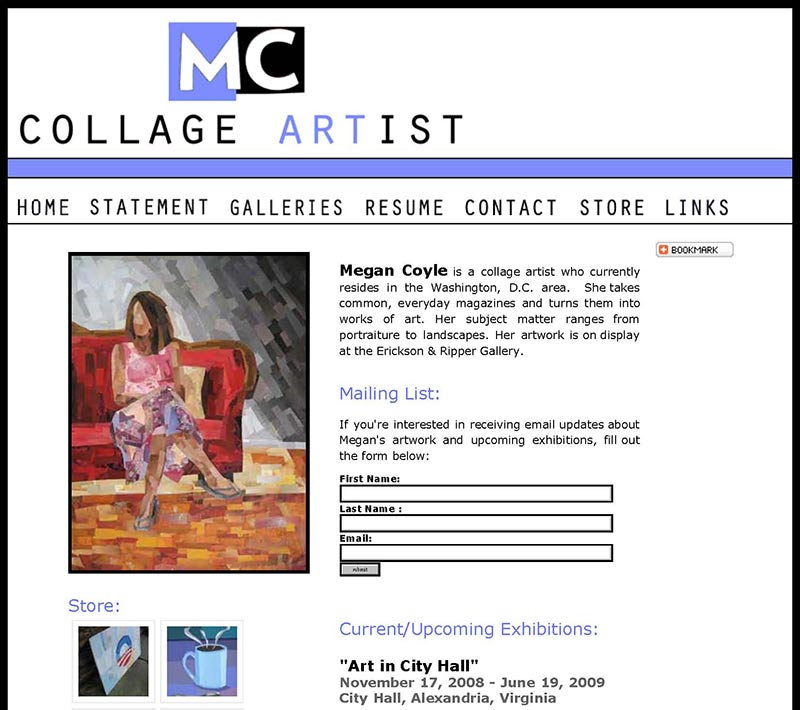
Aside from teaching myself to code, and continuing to read articles on the subject, I also started taking classes in graphic design. I was hungry to make my website better, but I also wanted to make it look better too. I ended up creating a logo for my site, which you can see above. I suppose I was pretty proud that I designed the logo all on my own, that initially it was rather large in the header.
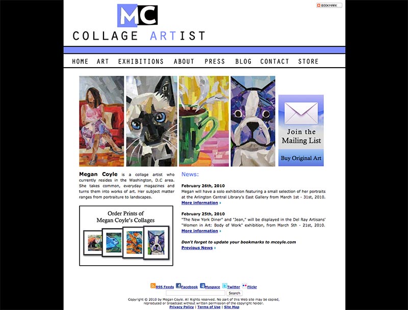
For the next version of my site, I realized I needed to shrink the logo down more, and I started featuring more images of my work on the homepage. Once I had a better handle on the basic look and feel, I started building it out more.
In 2010, I put together an educational section with online lesson plans, since I noticed that students and teachers were contacting me every year with questions about my work. I wanted to make it easier for others to learn about my process and technique.
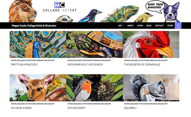
I continued to play around with the overall look and feel, as well as making improvements to the user experience, like making the website responsive.
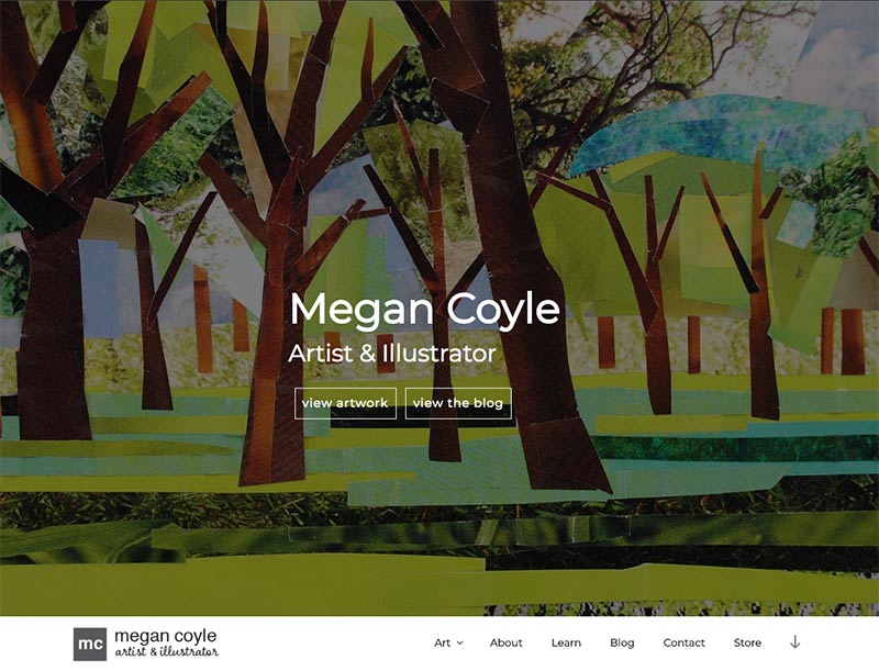
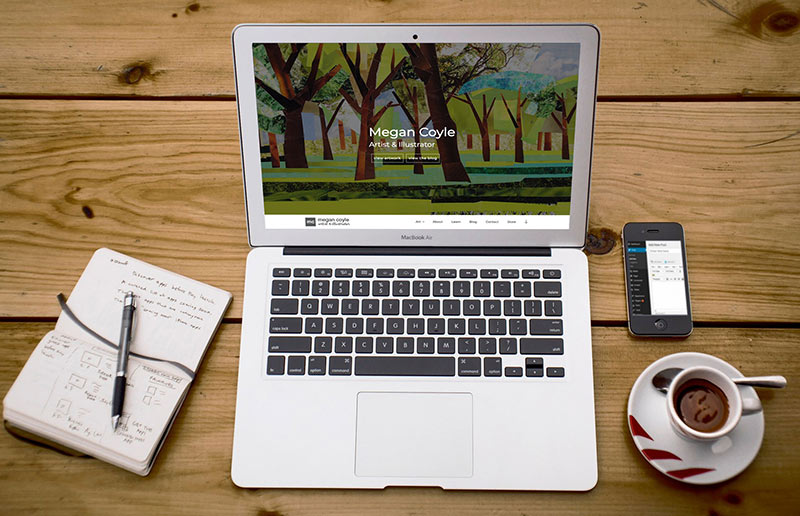
Earlier this year, I worked on redesigning my site once more. I even added an online store for purchasing my work directly from the site, to make things easier for users. I also redesigned the logo so it wouldn’t emphasize my collage work as much, which would open my work up to other mediums.
My site has come a long way. I’m proud that I’ve taught myself a number of things while going through the process of building it – such as learning about coding, web design, user experience design, and content creation. I’m so thankful that it’s easy to share artwork online – and by having a web presence, I’m able to reach people I never thought I’d be able to reach before.
