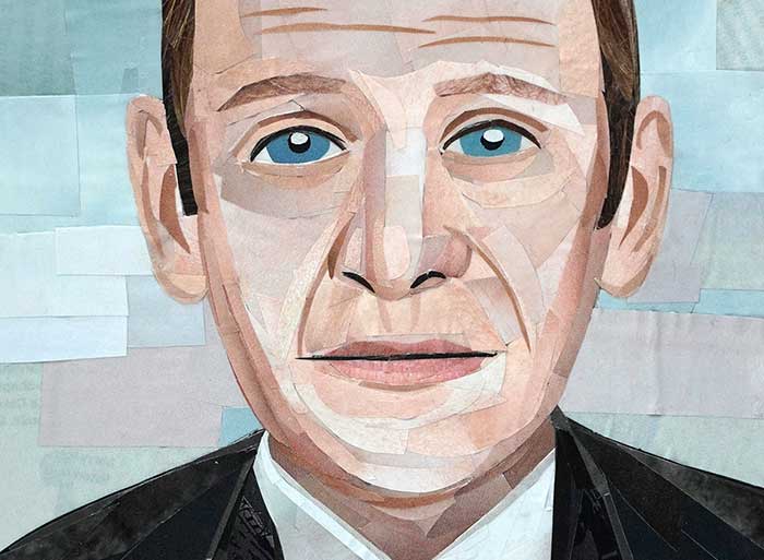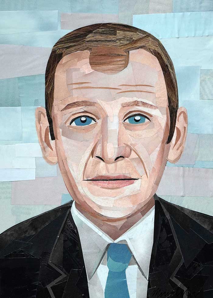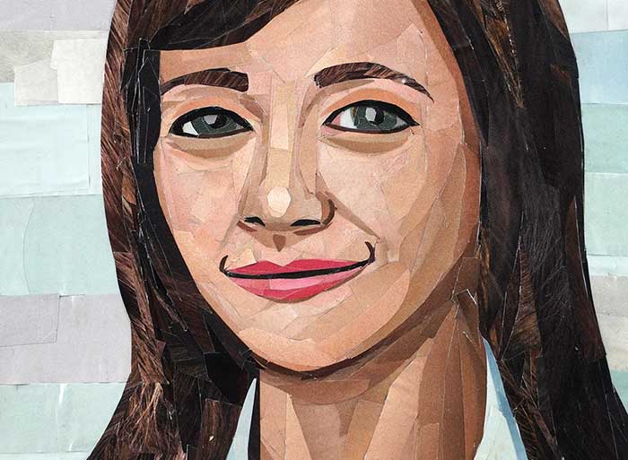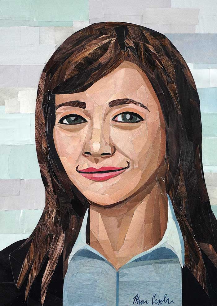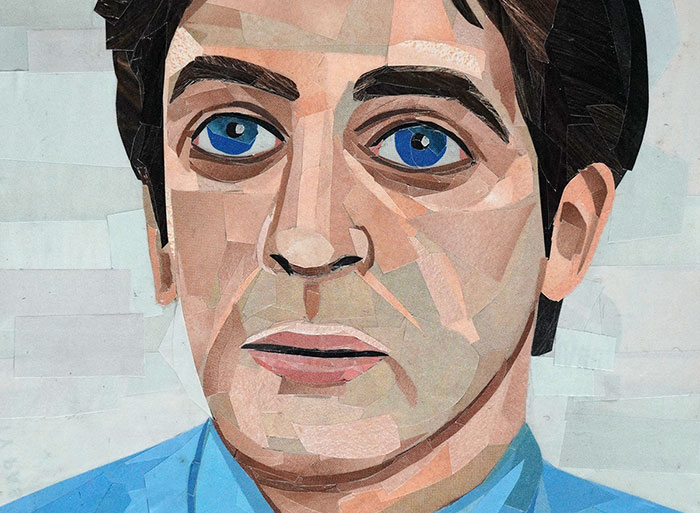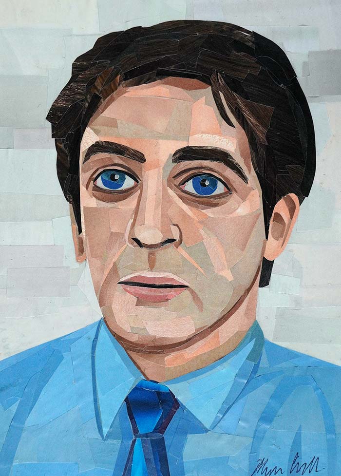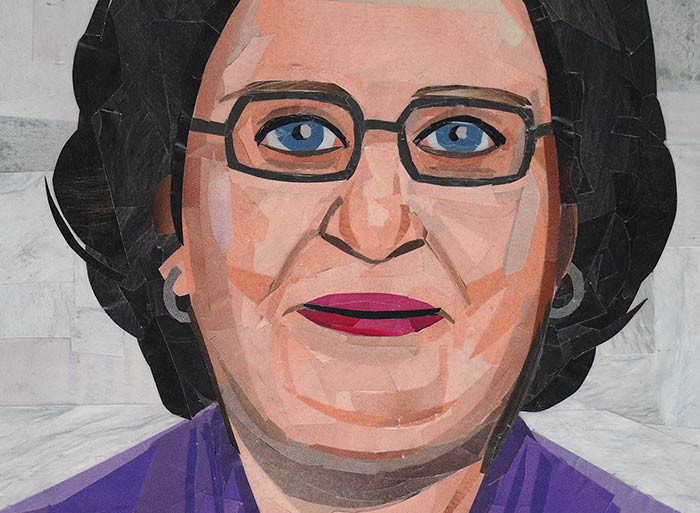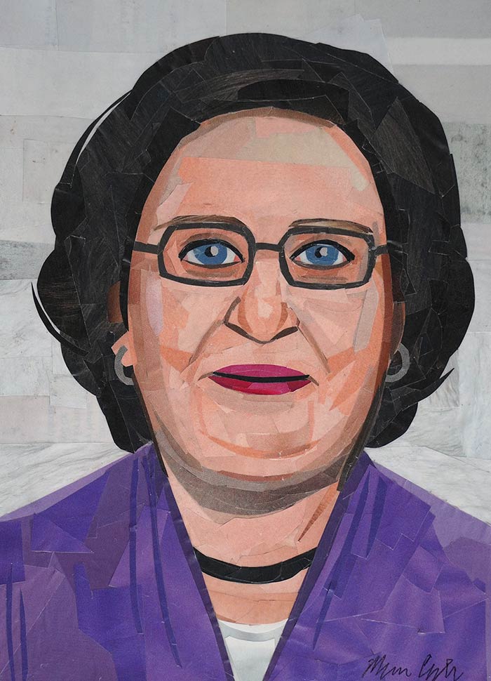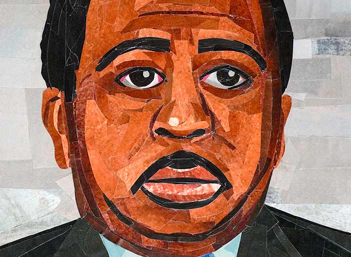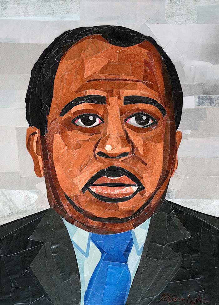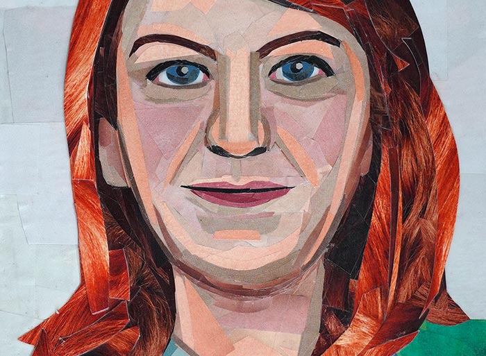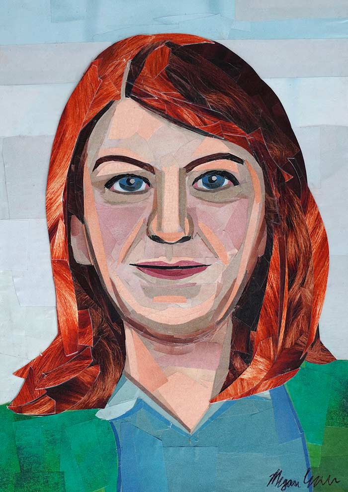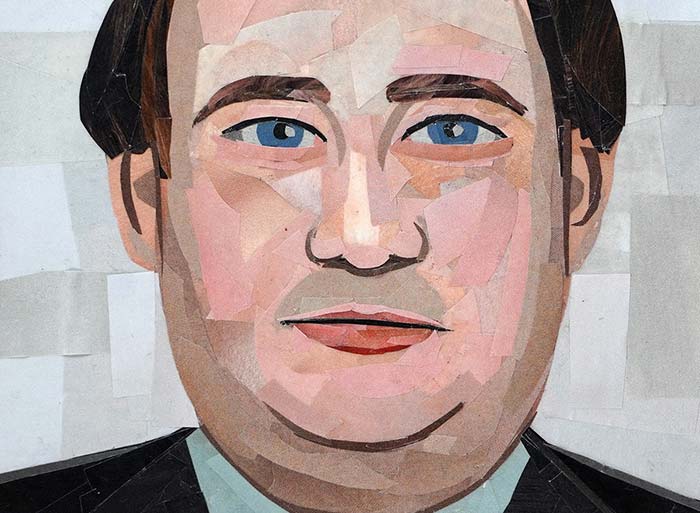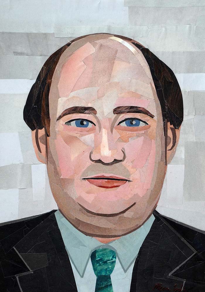
The challenge with portraiture is getting the likeness of the subject down properly. The past couple of months I’ve been focusing on portraiture, and I definitely feel rusty with this type of work. It also hasn’t come easy, so I’m doing my best these days to strive to improve and get better as an artist, especially with subjects that are a struggle. I’m looking forward to continuing to improve and get faster at this type of work (at the moment it’s slow going).
This portrait of Wednesday was inspired by the new show on Netflix. Lately I’ve been inspired to make illustrations of well known figures from the media, and I’m having a lot of fun exploring different characters. It’s been fun creating my own version of these characters.
This is the tenth portrait I’ve completed in my Stranger Things-inspired collage series. I’ve really enjoyed illustrating a number of characters from the show, and now I’m ready to move on to a new series. I’ll have to revisit this one in the future to add more characters, but for now, this is the final piece.
I had a lot of fun with this portrait and managed to complete it over the course of a few days. I’m a little surprised at how many portraits I’ve managed to complete this month. Life outside of art has been pretty busy, so I’m doing my best to make time for art. And again, this collage involved using fragments of images of jeans for her jacket, as well as fragments of photographs of hair for her hair. I also used the same texture for the background that I’ve been using for a number of the portraits in this series. The remainder of the piece involved layering a variety of solid colors.
And now I’m off to sketch out a portrait for my next collage…
I’m getting closer to finishing up my Stranger Things inspired portrait series for the time being. I’m planning to make one more piece, before I set this series aside for a little bit. I recently completed this collage this past weekend. Again, I focused more on using solid colors. Even though this collage came together relatively quickly (when compared to other portraits in the series), it felt like it was a bit of a struggle.
I suppose that’s why they call art a “practice.” I’m constantly practicing my craft. In many ways my collages never truly feel finished, since I’m constantly striving to improve and grow with my work.
It’s a New Year, which means it’s time for some new art. This is the first collage I’ve completed this year, and I’m still working my way through my Stranger Things collage portrait series. I think I’ll do at least three more before I move on to another series.
I had a lot of fun working on this piece. Erica is one of my favorite characters and I enjoyed working primarily with solid colors to complete this one – focusing a lot on different shadows and highlights. I especially like her colorful outfit.
Anyway, I hope everyone had a happy holiday! I’m looking forward to another year filled with art-making and adventure.
When I frame my collages, I like to use a UV-protective frame and acid-free mat board. Using acid-free materials for framing helps prevent discoloration of the original artwork from other materials that are overlapping the art from framing, such as mat boards or backing materials. UV-protective frames also help protect the original artwork from sunlight, which can cause fading and discoloration. In general, I recommend hanging artwork that’s on paper or made from paper out of direct sunlight whenever possible (to further protect the art).
I generally work in standard sizes for my artwork, which makes it easier for clients to frame the artwork themselves. The artwork in my online store is sold unframed (although I can frame pieces on request), and since most of my original artwork fits standard frames, it makes it easier for customers to order their own frames online. The trick to finding the right frame, is looking for frames that use acid-free mats and are UV-protective. I’ve previously used Nielsen Bainbridge frames, although you can also find other UV-protective options as well.
Back in 2011, I wrote and illustrated my first children’s book, Duck & Fish. When I was in college, I studied painting and creative writing, and had taken a hiatus from creative writing once I graduated from college. However, I was inspired to pick up writing again for this project after a number of people said that they’d love to see me write and illustrate a children’s book. So I suppose you could say I was inspired to write and illustrate a children’s book after enough people had asked me if I had ever thought about doing just that. I also liked the idea of merging together my two interests in art and writing into a project – thus, I decided to give it a try and tackle my first book.
I remember the project was pretty time-consuming since I put all my other collage work on hold as I began work on about 30 collage illustrations. It took me several months that year to complete all the illustrations after I had storyboarded out how I wanted things to look and had already completed the first draft of the text. I had a couple of friends proof-read my work and provide feedback. And as I finalized the illustrations, I worked on finalizing the copy.
When the text and artwork were complete, I photographed my collages, and decided on using Blurb for self-publishing my work. I didn’t want to wait on finding a publisher since I was eager to have my book readily available. However, after several years passed, I realized Blurb wasn’t very accessible to others who were interested in buying my book. In fact, the cost of printing a book was so high, that I could barely mark up the price at all to make a profit (I was making about $1 per book that sold when they were costing around $30 to print). Recently, I worked on reformatting my book to have it available on Amazon and Apple Books at a much more affordable price, and since it’s now on two popular platforms, it’s a lot easier to find.
Will I make another children’s book in the future? At this point, I like the idea of making another one, although I keep remembering how time-consuming the Duck & Fish book was to illustrate, so at the moment, I don’t think I’m ready to dive into another one just yet. I might actually explore writing a book about the creative process in the not so distant future.
I get asked this quite often, so I figured I’d share a list of all the materials that go into my collages, as well as links to those materials (to make things easier for anyone interested in making their own “painting with paper” collages). Here’s everything I use for my artwork:
1. Magazines
My collages are made entirely from magazine cutouts. Oftentimes, I recycle old magazines that friends and family members have given me, by turning them into new works of art. In the past, sometimes I’d subscribe to magazines so I’d have more materials to work with. One of my favorite magazines to use is Vogue, (or any fashion magazine) because they have so many ads and pages filled with various colors and patterns. I also really enjoy using National Geographic, especially when it comes to working on landscape pieces.
2. Glue
I like to work on my works in progress with a glue stick, because the glue is more temporary. This gives me more flexibility to peel up layers and move them around if I’m not crazy about the placement of the magazine cutouts. Once I’m finished with a collage, I’ll later varnish it to seal in the placement. My go-to glue stick is Elmer’s All Purpose Glue Sticks – they give me the right amount of flexibility and they’re acid-free (which is important when you’re working with delicate materials like paper).
3. Scissors
Some collage artists prefer using X-Acto knives because of the precision they get, however, I prefer using a good old pair of scissors (partially because I’m too clumsy to work with X-Acto knives). I currently have a couple of pairs of Scotch Multi-Purpose Scissors. Even though these scissors aren’t super small, I like working with them even when I’m cutting really tiny bits of paper.
4. Surface
Instead of working on canvas or Masonite board, I enjoy working on watercolor paper when I’m cutting and pasting magazine strips. I like using watercolor paper because it’s heavy enough to be more durable than other papers, and at the same time, it still gives me the flexibility to cut out portions of a collage if I’m not crazy about the direction that an entire composition is moving in. I can cut out the parts that do work and layer them on a fresh watercolor paper surface. My go-to paper is Strathmore.
5. Varnish
I always varnish a completed collage, and sometimes I’ll varnish a work in progress if the magazine cutouts are small enough in detailed areas (so those pieces won’t accidentally fall off). I like to use Liquitex’s Matte Varnish, but if you prefer to have a glossy surface to your collages, they also have a high gloss varnish that you can use. I like Liquitex’s varnish since it’s easy enough to layer, and it’s UV-protective.
If you want to frame your collages, I’d recommend using UV-protective glass and acid-free mats. Whenever possible, you want to work with materials that are acid-free and provide UV-protection to help protect the paper from discoloration over time.
As requested, I tackled Max Mayfield (Sadie Sink) for the next collage in my Stranger Things portrait series. This piece came together relatively easily, even though the sketch wasn’t entirely accurate. Often times I find myself working on reshaping areas of the subject’s features by layering magazine cutouts, especially when the sketch is really simple.
I enjoyed incorporating a little bit of texture for this piece with the stripes in her shirt and fragments of red hair from various magazine ads. Again, I used similar texture for the background that I’ve used for the other portraits. And I continued to use quite a few solid colors for her shirt and face.
Up next, I’m planning to make a portrait of Lucas Sinclair’s sister, Erica.
Artists make drawings as a way to express themselves creatively. Drawing can also be used as a way to plan future works of art or work through creative ideas. Overall, drawing is one of the many creative outlets artists can use.
Here’s an overview of why artists draw:
1. Creative expression
There are many different materials or mediums that artists can use to make artwork to express their ideas. Drawing is a technique that artists can use for some of those mediums, such as charcoal, color pencils, graphite, etc.
2. Get familiar/better with the medium
If an artist enjoys drawing or wants to improve drawing with a different medium, making more drawings can help with this. After all, practice helps you improve with any craft, and drawing is no exception to this rule.
3. Brainstorm ideas
Drawings are a way that artists can sketch out ideas for future works of art. They serve as a wonderful way to explore ideas and get a sense of what compositions may work for different mediums or scales.
4. Plan future works of art
Sketches/drawings also work really well when artists want to plan out future works of art. By planning out how to approach a composition through drawing, the artist can save time for when they approach the materials they’re using for the actual work of art and help them avoid running into as many errors (which can be costly depending on the materials used) as they’d run into otherwise.
Another day, another portrait completed in my Stranger Things series. “Will Byers” is now the sixth portrait I’ve made for the series, although this one didn’t come together that smoothly. Portraiture continues to be a bit of a struggle for me, but hopefully the more I practice it, the more I’ll approve.
This piece involved a few more patterns and textures from magazine pages than my previous pieces used, especially when it came to the flannel pattern for Will’s shirt. When this was a work in progress, there was a bit of struggle and reworking of the shape of Will’s face, but eventually I shaped it in such a way that I felt I could deem the portrait complete.