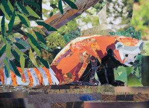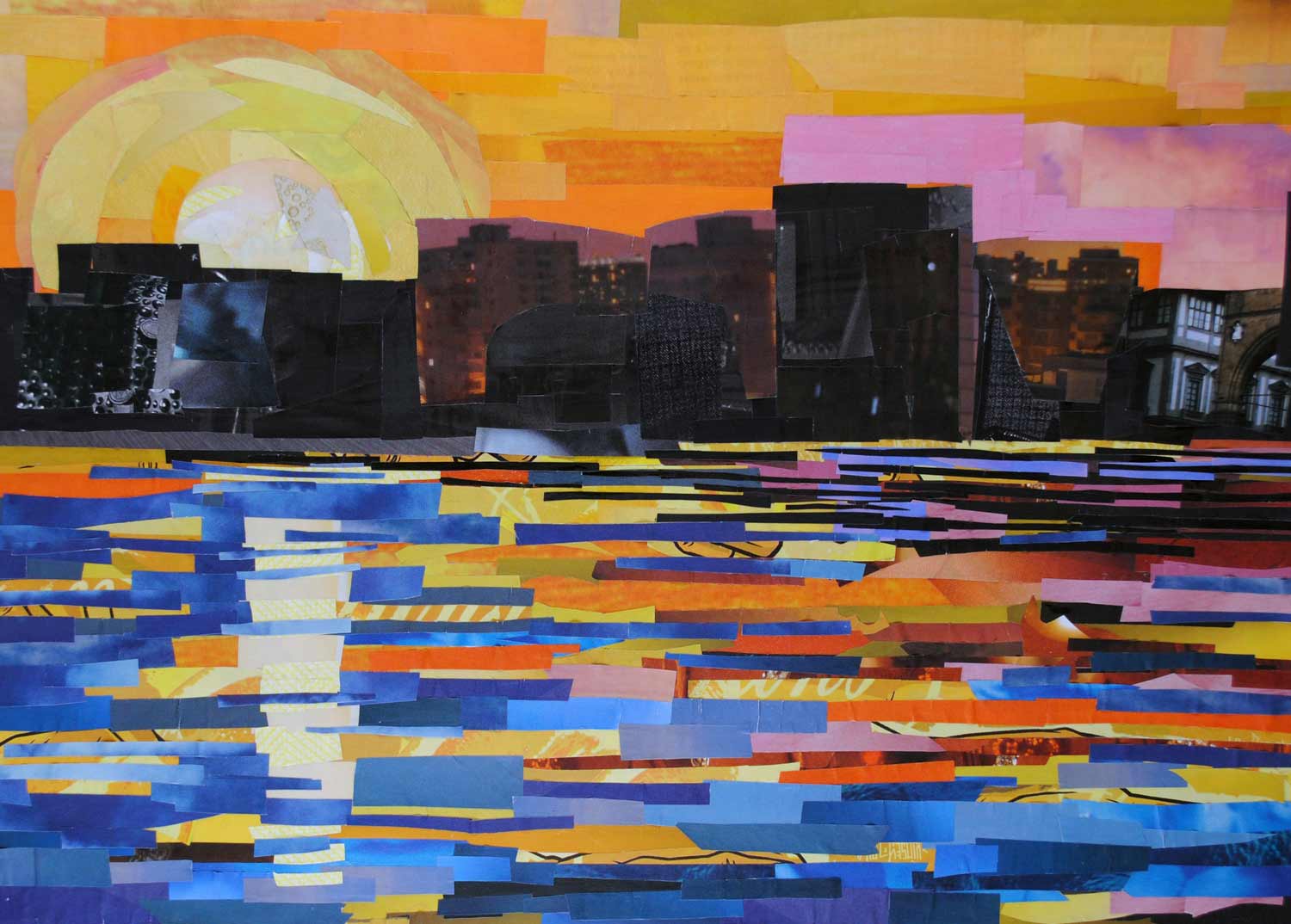
The way you use setting and color can create a certain mood for your animal collage. This means that setting and color can help shape the way someone feels when he or she is looking at your artwork. Dark, dreary colors can make the artwork look gloomy while bright colors (like green, orange, and yellow) can make the artwork look cheerful.
Using natural colors can be useful if you want to focus on the way an animal looks in real life. However, if you want the animal to looks more like a character illustration, you can use arbitrary colors. Arbitrary colors can also make the artwork’s mood more noticeable – for example, you can make the animal blue if you want the viewer to think that the artwork has a sad tone.
Here are some examples of how you can use arbitrary color:


You don’t need to focus just on color to make the artwork have a specific mood. You can also create a certain mood depending on the environment or habitat that the animal is in. Take a look at this hippo collage – doesn’t the combination of black and white and the cage setting make this piece a bit dreary?
The colors you use for the setting can also create a mood. If you use bright colors for the background, like a bright, green forest , the work of art can look joyful. If you use darker colors, the artwork can look gloomy.
Take a look at how the setting was used to create certain moods for these animal collages:


How did each setting above make you feel? Which colors does Coyle use more than others? What do those colors make you think of?

